

For about four years our standard monthly report ran past twenty pages. It had everything a good report was supposed to have: an executive summary, a traffic overview, keyword movement across several hundred tracked terms, a link acquisition table, technical health, content published, and a closing section on next month's priorities. Clients said it was thorough. We believed thorough was the point.
Then we did something slightly uncomfortable. We went back through a year of client calls and tried to identify, for every recurring metric in that report, a single decision that had ever been made because of it. Not a conversation. A decision - a budget moved, a page rewritten, a priority reordered, a plan changed.
Most of the report failed the test. Entire sections had never once changed what anyone did. They were read, occasionally admired, and then everyone went back to talking about the two or three numbers that actually mattered to the business. We had spent four years producing a document whose main function was to demonstrate that we had been busy.
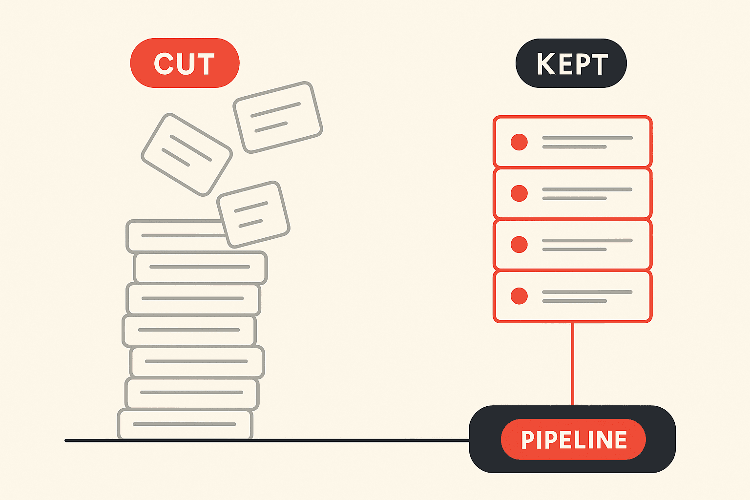
So we cut it. Nine recurring metrics came out of the client-facing report entirely, and the structure that remained got rebuilt around three layers instead of eight sections. The report now runs to about six pages.
This piece is the full account: why reports get bloated in the first place, each of the nine metrics we removed and what it was really doing, what we kept and what replaced the deleted sections, what actually happened afterwards including the parts that were awkward, and how to run the same cut on your own reporting without damaging the client relationship in the process.
What We Cut and What We Kept
For readers who want the summary before the reasoning:
Removed from the client report: average keyword position across the full tracked set, impressions, Domain Authority and Domain Rating, bounce rate, total organic sessions as the headline number, backlinks acquired this month, average time on page, pages crawled and pages indexed, and the activity log of completed tasks.
Kept or added: organic-sourced pipeline and qualified leads, revenue or pipeline by landing page, non-brand organic clicks separated from brand, individually tracked positions for a short named list of commercial terms, visibility in AI answer engines, and a standing risk section.
Nothing was deleted because it was fake. Every one of those nine numbers is real data measuring a real thing. They were deleted because in a client report they answered questions nobody was asking, and their presence made the numbers that mattered harder to find.
Why SEO Reports Get Bloated in the First Place
It is worth being honest about the mechanism, because the same forces will re-bloat your report within a year if you do not name them.
The first force is insecurity about invisible work. SEO in any given month is mostly unglamorous: internal linking, a technical fix, three briefs, a slow negotiation with a developer. None of it looks like anything. A long report is a way of making invisible labour visible, and it is a genuinely tempting solution when a client is three months into a twelve-month horizon and getting nervous. The problem is that it trains the client to evaluate you on volume of activity, which is the worst possible frame for a discipline where the highest-leverage month might involve deleting two hundred pages.
The second force is that tooling defaults to inclusion. Every reporting platform ships with templates, and every template is built to showcase the breadth of the tool's data. That is a reasonable commercial decision by the vendor and a bad editorial decision for you. If you build your report by connecting a data source and accepting the default widgets, you have outsourced the most important judgement in the engagement - what counts as important - to a company that has never met your client.
The third force is that nobody ever gets in trouble for including something. Adding a metric feels free and removing one feels risky. Over four years, that asymmetry alone will produce a twenty-page report without anyone ever deciding to build one.
The cut is therefore not a one-time cleanup. It is a standing editorial position that has to be re-argued roughly once a year.
The Nine Metrics We Stopped Reporting
Each of these gets the same treatment: what it is, why we were reporting it, why it had to go, and what took its place.
1. Average keyword position across the full tracked set
Why we reported it. It is a single number that appears to summarise SEO performance, and clients liked having one. It also moves often enough to fill a slide every month.
Why it went. Average position across a large tracked set can improve while the business gets worse, and it does so routinely. The mechanism is simple arithmetic: the average is sensitive to what is in the set, and tracked sets grow over time as new content ships. Add forty informational long-tail terms that rank at position six and the average improves, while nothing about commercial visibility has changed. Worse, the metric is trivially gameable in the direction of self-flattery, and once we noticed we could improve our own scorecard by choosing what to track, we stopped trusting it as a report line.
What replaced it. A short named list - usually eight to fifteen terms - of queries a buyer would plausibly search immediately before purchasing, tracked individually, each with a sentence on why it is commercially important. It is less tidy and much more useful. When one of those moves, something real has happened. If internal competition is what's suppressing those terms, that shows up as a specific diagnosis rather than a blended average, which is the case for running a proper keyword cannibalization audit instead of watching a mean drift.
2. Impressions
Why we reported it. It is right there in Search Console, it is usually the biggest number available, and a rising impressions line looks like momentum.
Why it went. Impressions rise for reasons that are frequently unrelated to progress, most often when pages begin surfacing at low positions for a widening set of loosely relevant queries. That produces the specific failure mode we came to dread: impressions climbing steeply while clicks stay flat, a client seeing the climb and concluding things are going well, and us spending ten minutes of a thirty-minute call explaining why the good news is not news. Any metric that regularly requires you to talk a client down from a reasonable interpretation is costing you more than it delivers.
What replaced it. Nothing in the report. Impressions stayed in the working file, where they do genuine diagnostic work as a denominator - impressions up with clicks flat points at click-through rate or a SERP feature eating the click, impressions down with position stable points at demand. That diagnostic belongs in the analysis that produces the report, not in the report itself. When the SERP itself is what changed, that is a specific finding worth a paragraph, and we have written separately about why a number one ranking can stop driving traffic.
3. Domain Authority and Domain Rating
Why we reported it. Clients had heard of it. It gave the link programme a visible scoreboard, and it went up over time, which made it pleasant to include.
Why it went. Two reasons, one technical and one behavioural. The technical reason is that these are third-party modelled scores that approximate ranking potential and are not used by Google. They move on the vendor's recalculation schedule, which means your score can change in a month when nothing whatsoever happened on your site.
The behavioural reason matters more and is the one we underestimated. Any number that appears in a monthly report becomes a target, and targets change behaviour. We watched the presence of a link score in the report gently pull conversations toward cheaper links that would move it, and away from the small number of hard, genuinely valuable placements that move a business but barely register on a domain-level score. We were, in a small way, incentivising our own worst work.
What replaced it. The link section now reports referring domains from publications a plausible buyer might actually read, the specific pages those links point at, and what happened to those pages afterwards. It is a shorter section that occasionally has to say a quiet month happened, which is a fair price for it being true. Our position on how that work should be earned is set out in more detail on our link building services page and in our approach to digital PR.
4. Bounce rate
Why we reported it. Habit, mostly. It had been in reports since before GA4 redefined engagement, and it carried an intuitive story about content quality.
Why it went. Bounce rate is close to uninterpretable without knowing page intent, and reporting it at site level averages together pages whose ideal behaviour is opposite. A blog post that answers a question completely and sends a satisfied reader away has done its job perfectly and records a bounce. A pricing page with the same bounce rate has failed. Reporting one number across both is not simplification, it is noise, and the GA4 engagement redefinition made the historical series inconsistent on top of that.
What replaced it. Page-level engagement read against the job that specific page was hired to do, which mostly lives in the working file, plus conversion rate on the pages where converting is the point. For clients running a serious content programme, we point them at the more useful framing in content metrics that predict revenue.
5. Total organic sessions as the headline number
Why we reported it. It is the default headline of every SEO report ever written, and for a long time it was a decent shorthand for progress.
Why it went. Blended organic sessions hide the single most important distinction in the whole dataset, which is brand versus non-brand. A brand running television or heavy paid social will see organic sessions climb because more people are searching its name, and an SEO programme can take credit for demand it did not create. The reverse is uglier: genuinely good non-brand growth can be masked by a brand-search decline, and the agency doing the best work of the engagement gets a falling chart.
What replaced it. Non-brand organic clicks as the traffic headline, with brand reported separately and explicitly framed as a demand signal rather than an SEO outcome. This was the single most contested change we made, and also the one that improved conversations the most, because it forced an honest discussion about which parts of growth marketing were actually working. It also sharpens the perennial budget question we cover in SEO vs PPC: which should you invest in first.
6. Backlinks acquired this month
Why we reported it. Link building is expensive and clients want to see what the money bought. A count is the most obvious way to show it.
Why it went. A count treats a mention in a national business publication and a listing on a directory as the same unit, which is not a rounding error but a category mistake. Reporting the count also creates a monthly volume expectation on a workstream whose good months are lumpy and unpredictable, which quietly pressures the team toward whatever is easiest to acquire in the last week of the month.
What replaced it. A named list of placements with the publication, the target page, and a line on why that placement was worth pursuing. Fewer rows, considerably more information, and it makes a genuinely strong month obvious in a way a number never did.
7. Average time on page
Why we reported it. It looked like a proxy for content quality, and content quality is otherwise hard to show.
Why it went. It is a poor proxy measured on unreliable foundations. Time on page has always been distorted by how the final page in a session is measured, and it rewards the wrong outcome: a reader who finds an answer in fifteen seconds has had an excellent experience and drags the average down. For content whose purpose is to answer a question efficiently - which is most of what we publish now, and increasingly what AI answer engines reward - the metric is close to inverted.
What replaced it. Scroll and completion signals for genuinely long-form assets where finishing matters, and conversion or assisted-conversion behaviour everywhere else. Most of it stays out of the client report and inside the content review.
8. Pages crawled and pages indexed
Why we reported it. It demonstrated technical diligence and filled the technical section with something numeric.
Why it went. In steady state these numbers are flat, and a flat number reported monthly teaches the reader to skip that section - which is a genuine hazard, because the technical section is where the actually urgent things appear. We were spending the client's limited attention on a line that was almost always unchanged, and burning the credibility of the section that occasionally needed to be read carefully.
What replaced it. An exception-only technical block. It is empty most months and says so in one line. When it is not empty, it names the problem, the affected pages, the estimated commercial exposure and the fix date. Clients read it now, because its presence means something. The underlying discipline behind that section is what we do in a technical SEO engagement and in a standalone SEO audit, and when traffic does drop unexpectedly we work it through a structured diagnostic rather than a guess.
9. The activity log
Why we reported it. It was the most direct answer to the question every retainer client eventually asks, which is what exactly are we paying for.
Why it went. Because it answers that question in the most damaging possible way. A list of completed tasks invites the client to evaluate the engagement by counting outputs, and it makes the highest-leverage months look the weakest. The month we consolidated a client's overlapping pages and deleted a large amount of underperforming content produced a very short activity log and one of the best outcomes of that engagement. A report format that makes your best work look like your laziest month is actively working against you.
What replaced it. A short narrative section - three or four paragraphs - explaining what we did, why we chose it over the alternatives, and what we expect it to produce and by when. It is harder to write than a list, which is precisely why it is worth writing. It also creates an accountable record: last quarter's expectations are visible next to this quarter's results.
The Three-Layer Structure That Replaced the Dashboard Dump
Deleting nine metrics leaves a hole, and the hole is where most report redesigns fail. What we put in its place was not a shorter list of the same kind of thing but a different organising principle. The report now has three layers, and every candidate metric has to earn a place in one of them.
Layer one is outcome, and it goes first. Organic-sourced pipeline, qualified leads from organic, and revenue or pipeline broken out by landing page. This is the layer written for the person who signs the invoice, and putting it on page one was the change that most improved how our calls went. When a client opens a report and immediately sees the number they care about, the rest of the conversation happens from a position of trust rather than suspicion.
Where a client genuinely cannot attribute revenue - long offline cycles, phone-led buying, regulated categories - we agree a proxy before the engagement starts and label it as a proxy in the report itself. Qualified enquiries against a quality bar defined with the client, not raw form fills. Getting this definition right at kickoff is worth more than any subsequent reporting improvement, and it is closely tied to the attribution model the business is actually able to run.
Layer two is leading indicators, and it explains whether layer one will hold. Non-brand clicks, the named commercial terms, answer-engine visibility, and the state of the content and link programmes. This is the layer for whoever owns marketing day to day. It is diagnostic rather than evaluative: its job is to explain the outcome number above it and forecast the one arriving next quarter.
Layer three is risk, and it is the section clients thank us for most. Anything that could damage next quarter: indexation problems, a Core Web Vitals regression, content that is visibly decaying, pages that have quietly lost their internal links, a competitor movement worth naming. Most months it is short. The discipline is that it is never omitted, because a risk section that appears only when there is bad news becomes a section clients learn to dread.
Adding One Thing Back: AI Answer Engine Visibility
The cut was not purely subtractive. One genuinely new thing went in, and it is the only addition we have made in three years that has earned its place immediately.
A growing share of the questions our clients' buyers ask never reach a blue link. They are asked inside ChatGPT, Perplexity, Google's AI Overviews and similar systems, and they are answered with a synthesis that may or may not name the brand. That entire surface is invisible in a report built on sessions and rankings, which produces a dangerous failure mode: a brand losing ground in the channel that increasingly shapes consideration, while its SEO report looks completely stable. We wrote up the scale of that gap after auditing fifty D2C brands for AI visibility, and the short version is that most brands are far less visible there than they assume.
What we report is deliberately modest. A fixed set of buying-intent prompts, run on a consistent schedule, recording whether the brand is named and whether it is cited as a source, reported as a direction over time rather than a precise score. We say plainly in the report that this measurement is less mature than click data and that the underlying systems are non-deterministic. Reporting it imperfectly is still far better than leaving a real and growing surface unmeasured, and the method is set out in more detail in our guide to AI citation tracking. If you are ranking well on Google and suspect you are absent from the AI layer, that specific gap is worth diagnosing before it becomes a revenue problem.
What Actually Happened After We Cut
The honest account, including the parts that did not go smoothly.
Two clients asked for removed metrics back within the first quarter. One wanted Domain Authority, one wanted total sessions. We put both back the same week. What we learned from those two conversations reshaped how we handle the whole thing: neither client actually wanted the metric. The founder asking for Domain Authority wanted reassurance that the expensive link work was real, and the marketing head asking for total sessions was being asked for a single growth number by a board that had always been given one. Once we understood the underlying need, we could serve it better - a named placement list for the first, a clearly labelled blended growth line for the second - and both eventually stopped asking for the original metric. But we only got there by restoring it first and asking questions second.
Call quality changed more than anything else. The reports were previously walked through, section by section, for most of the call. Now the report is read before the call, and the call is spent on decisions. That was the actual prize, and it was not the one we were aiming at when we started.
One thing got harder, and it is worth naming. Shorter reports make weak months more visible. A twenty-page report can absorb a bad month inside its own volume; a six-page report that opens with pipeline cannot. We think that is correct, and we would not reverse it, but anyone planning this change should understand they are removing their own cover. If the work is not good, a shorter report will make that obvious faster - to the client, and to you.
We have not lost a client because the report got shorter. We also cannot claim it won us any, and we are wary of the kind of tidy causal story this sort of piece usually ends with. What we can say is that the internal cost of producing reports fell substantially, and that time went into analysis instead of assembly.
How to Run the Same Cut on Your Own Reporting
If you want to do this, the sequence below is roughly what we would repeat.
- Run the decision test on twelve months of history. For each recurring metric, find one decision that changed because of it. Not a discussion - a decision. Be strict, and expect an uncomfortable result.
- Sort every metric into report, working file, or delete. Most things move to the working file rather than disappearing. This is the step that makes the cut psychologically possible for the team, because nothing is actually being thrown away.
- Establish the outcome layer before removing anything. Never delete first. If you remove the traffic charts before you have a pipeline number the client trusts, you have taken away the old answer without providing a new one, and you will lose the argument.
- Get the qualified-lead definition agreed in writing. With the client, ideally with someone from their sales side present. This single conversation prevents most future reporting disputes.
- Split brand from non-brand before you present anything. Expect this to be contentious and expect it to be worth it.
- Tell the client what you are doing and why, in advance. Frame it as a change in what you are accountable for rather than a reduction in what they receive. Offer a live dashboard or appendix for anyone who wants the underlying detail, and mean the offer.
- Restore anything they ask for, immediately, then ask what decision it serves. The report belongs to the client. Being right about metric selection is worth much less than being easy to work with.
- Re-run the cut annually. Reports re-bloat. The forces described earlier do not go away because you defeated them once.
The same logic transfers cleanly to paid media, where the equivalent exercise is usually cutting impression share and click volume in favour of blended efficiency - the framing we use in our Google Ads audit work and in the performance marketing metrics we hold teams to.
What We Still Argue About Internally
Three of these are unresolved, and it would be dishonest to present the system as settled.
Whether non-brand clicks should be the headline instead of pipeline. Clicks are cleanly attributable to SEO work; pipeline is contaminated by sales capacity, pricing changes and demand shifts we do not control. The counter-argument, which currently wins, is that a metric an agency fully controls is exactly the metric a client should be most suspicious of.
How much AI visibility measurement to report given how immature it is. Systems are non-deterministic, results vary by phrasing and location, and there is no stable industry standard. We currently report direction and say so. Some of the team think even that overstates our confidence.
Whether the risk section should carry commercial estimates. Attaching a rupee figure to a technical problem gets it fixed dramatically faster. It also requires assumptions we cannot always defend, and a wrong estimate is a credibility liability. We currently include ranges with the assumptions stated, and we are not fully comfortable with it.
The Underlying Principle
A client report is not an inventory of your work. It is a decision document for someone with limited attention and real money at stake. Every number in it either helps that person decide something or competes with the numbers that would.
Once we started treating report space as genuinely scarce - as scarce as the client's attention actually is - most of what we had been sending for four years failed to justify its place. Deleting it was the single cheapest improvement we made to how we communicate results, and it cost nothing but the willingness to be less impressive-looking on paper.
If you want a second opinion on what your current reporting is actually telling you, or on what your organic programme should be accountable for, talk to us - it is the first thing we look at in any SEO engagement we take on.
Frequently Asked Questions
What should an SEO report include?
An SEO report should include the smallest set of numbers that would change a decision if they moved, and almost nothing else. In practice that means three layers. The outcome layer carries organic-sourced pipeline or revenue, qualified leads from organic, and revenue or pipeline broken down by landing page - the numbers a finance-minded reader can act on. The leading-indicator layer carries non-brand organic clicks separated from brand clicks, ranking positions for a short named list of commercially important terms rather than the whole tracked set, and visibility in AI answer engines. The risk layer carries anything that threatens next quarter: indexation problems, Core Web Vitals regressions, expiring content, or a competitor movement worth naming. Everything outside those three layers is usually there to demonstrate effort rather than to inform a choice. The test we apply to every proposed line item is simple - if this number doubled or halved, would anyone do something differently? If not, it belongs in the working file, not the report.
How long should a monthly SEO report be?
Short enough that the client reads all of it before the call, which for most engagements means roughly four to eight pages. Our own report ran past twenty pages for years, and the honest reason was that length felt like proof of work. It was not. Long reports get skimmed for the one chart the reader already cares about, which means the agency loses control of the narrative anyway. The functional constraint is attention rather than page count: a report that takes forty minutes to absorb will be read by nobody senior enough to renew the contract, while a six-page report that opens with pipeline gets read by the person who signs. If the underlying detail matters, keep it in a linked appendix or a live dashboard the client can open when they want it, and let the report itself stay a decision document.
Are keyword rankings still worth reporting in 2026?
Selected rankings yes, aggregate rankings no. The metric that stopped earning its place is average position across a large tracked set, because it blends terms of wildly different commercial value into a single number that can improve while revenue falls. Adding fifty low-intent informational keywords to a tracking list will lift an average position figure without adding a rupee. What still deserves reporting is a short named list of terms that a buyer would plausibly search immediately before purchasing, tracked individually, with the commercial reasoning attached. Rankings have also become less complete as a picture of visibility, because a page can rank first and still lose the click to an AI Overview or a SERP feature, which is why we now pair the named-term list with click data and answer-engine visibility rather than letting position stand alone.
What are vanity metrics in SEO?
A vanity metric is any number that reliably goes up with activity but does not connect to a decision or to money. In SEO reporting the recurring offenders are impressions, total sessions used as a headline, Domain Authority or Domain Rating, raw backlink counts, social shares, pages crawled, and a list of tasks completed. What makes them vanity is not that they are meaningless in every context - impressions genuinely matter when you are diagnosing a click-through problem, and link counts matter inside a link team's working file. It is that in a client report they answer a question nobody asked, and they crowd out the numbers that would have prompted action. A useful diagnostic is to ask who the metric is for. If the honest answer is that it makes the agency look busy or the chart look healthy, it is a vanity metric regardless of how real the underlying data is.
Should an SEO report include impressions?
Not as a headline number, and usually not as a standalone chart. Impressions inflate for reasons that have nothing to do with performance, most commonly when a page starts surfacing for a wide set of loosely related queries at low positions, which produces a rising impression line during a period of flat or falling clicks. Clients who see that line reasonably conclude things are improving, and the agency then has to spend part of the call explaining why the good-looking number is not good news. Where impressions genuinely earn their place is as a denominator inside a diagnosis: impressions up with clicks flat is a click-through-rate or SERP-feature problem, impressions down with position stable is usually a demand or seasonality problem. We kept impressions in the working file where that diagnostic work happens, and took them out of the report where they were only ever decoration.
Is Domain Authority worth reporting to clients?
No, and we think reporting it does quiet long-term damage. Domain Authority and Domain Rating are third-party modelled scores built by tool vendors to approximate ranking potential. They are useful for comparing prospects quickly or filtering a link list, but Google does not use them, they move on the vendor's schedule rather than on your site's, and they can rise in a month where nothing commercially useful happened. The deeper problem is what reporting the score teaches the client. Once a number is in the report every month, it becomes a target, and targets shape behaviour - we have seen brands ask for cheap links purely to move a vendor score, which is a strictly worse use of budget than earning fewer, better placements. We now report the link work through what it was meant to achieve, which is referring domains from publications a real buyer might read, plus the rankings and citations those placements supported.
How do you report SEO results when the client has no revenue data?
You agree on the closest available proxy before the engagement starts, and you write down that it is a proxy. Plenty of businesses genuinely cannot attribute revenue to organic - long offline sales cycles, phone-led buying, marketplaces, regulated categories with limited tracking. In those cases the outcome layer becomes qualified enquiries rather than revenue: form submissions that passed a defined quality bar, tracked calls over a minimum duration, demo requests that a salesperson accepted. The important discipline is defining quality with the client rather than counting raw form fills, because raw lead volume is a vanity metric wearing a business suit. We also ask for a periodic sanity check from the sales side, even an informal one, so that the proxy stays anchored to reality. A proxy everyone agreed on beats a revenue number nobody trusts, and it beats retreating to traffic charts because attribution was hard.
How often should SEO reports be sent?
Monthly for the written report, with a quarterly session that does the actual strategic work. SEO moves too slowly for weekly reporting to show signal, and weekly cadence tends to manufacture anxiety - a two-position drop that would have reversed on its own becomes an urgent email thread. Monthly is long enough for movement to mean something and short enough that problems surface before they compound. The quarter is where the more valuable conversation happens, because a quarter is roughly the horizon on which content investments, technical fixes and link acquisition actually resolve. What we do send between reports is exception-based rather than scheduled: if something breaks or a meaningful opportunity appears, that goes out the day we find it, not on the first of the following month.
Should SEO reports include AI search visibility?
Yes, and it is now one of the few genuinely new additions worth the space. A growing share of the questions a brand's buyers ask get answered inside ChatGPT, Perplexity, Google's AI Overviews and similar systems, where the outcome is a citation or a recommendation rather than a click. That activity is invisible in a traditional report built on sessions and positions, so a brand can lose ground in the channel that increasingly shapes consideration while its SEO report looks stable. We track a fixed set of buying-intent prompts, record whether the brand is named and whether it is cited as a source, and report the direction over time. The measurement is less mature than click data and we say so in the report, but reporting it imperfectly is far better than leaving a real and growing surface entirely unmeasured.
What do you say when a client asks for a metric you removed?
You put it back, and then you ask what decision they are trying to make with it. The mistake is treating the cut as a policy to defend, because the report belongs to the client rather than to the agency. In practice the request is almost always downstream of a real need that the removed metric was serving badly - a founder asking for Domain Authority usually wants reassurance that the link work is real, and a marketing head asking for total sessions is often being asked for a growth number by someone above them. Once you know the underlying need, you can usually serve it better with something else, and most clients accept the swap when it is framed as an upgrade rather than a refusal. When they still want the original number after that conversation, we include it without argument. Losing a small point about metric purity is much cheaper than being the agency that decides what its client is allowed to see.
Related Reading on Measurement and Reporting
- Content Metrics That Predict Revenue (Stop Tracking Blog Traffic)
- 10 Performance Marketing Metrics That Actually Connect to Revenue
- Marketing Attribution Models Explained
- 10 Google Analytics 4 Insights Most Marketers Are Missing
- Internal Site Search: The SEO Goldmine Hiding in Your GA4
- How to Diagnose a Google Search Console Traffic Drop
- AI Citation Tracking: Measure Brand Mentions on ChatGPT and Perplexity

Aditya Kathotia
Founder & CEO
CEO of Nico Digital and founder of Digital Polo, Aditya Kathotia is a trailblazer in digital marketing. He's powered 500+ brands through transformative strategies, enabling clients worldwide to grow revenue exponentially. Aditya's work has been featured on Entrepreneur, Economic Times, Hubspot, Business.com, Clutch, and more. Join Aditya Kathotia's orbit on LinkedIn to gain exclusive access to his treasure trove of niche-specific marketing secrets and insights.